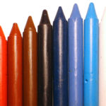
White is often considered the safest color in retail design.
It feels clean, modern, and versatile. Many brands default to white walls and fixtures under the assumption that “white goes with everything.” But in pop up shop design, white is not neutral — it is strategic.
Before deciding whether to use white in your store, it’s important to understand how it affects perception, lighting, and customer experience. For a broader understanding of how color influences buying behavior, see our guide to pop up store color psychology.
This article focuses specifically on the role of white in retail environments — its advantages, risks, and best-use cases.
Why White Is Popular in Pop Up Shops
White offers three immediate advantages in temporary retail spaces:
1. It Reflects Light
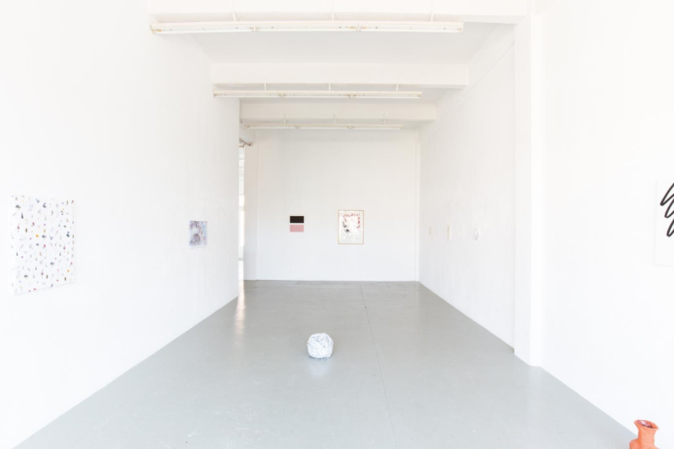
White amplifies both natural and artificial light.
In smaller retail units, this reflection increases perceived space and brightness. When combined with thoughtful lighting, white can make a compact pop-up feel open and breathable.
If you are working with limited square footage, consider reviewing our guide to small pop up shop design to ensure color and layout work together effectively.
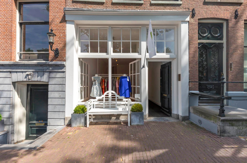
2. It Creates a Contemporary Look
White interiors are strongly associated with modern, minimalist retail.
Sleek shelving, clean lines, and restrained merchandising pair naturally with white walls. For fashion brands, art-focused activations, or product launches, this aesthetic can feel premium and intentional.
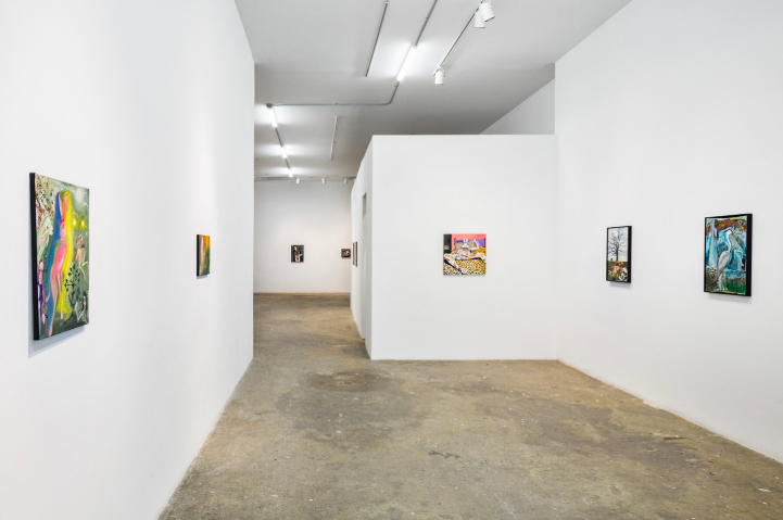
3. It Allows Products to Stand Out
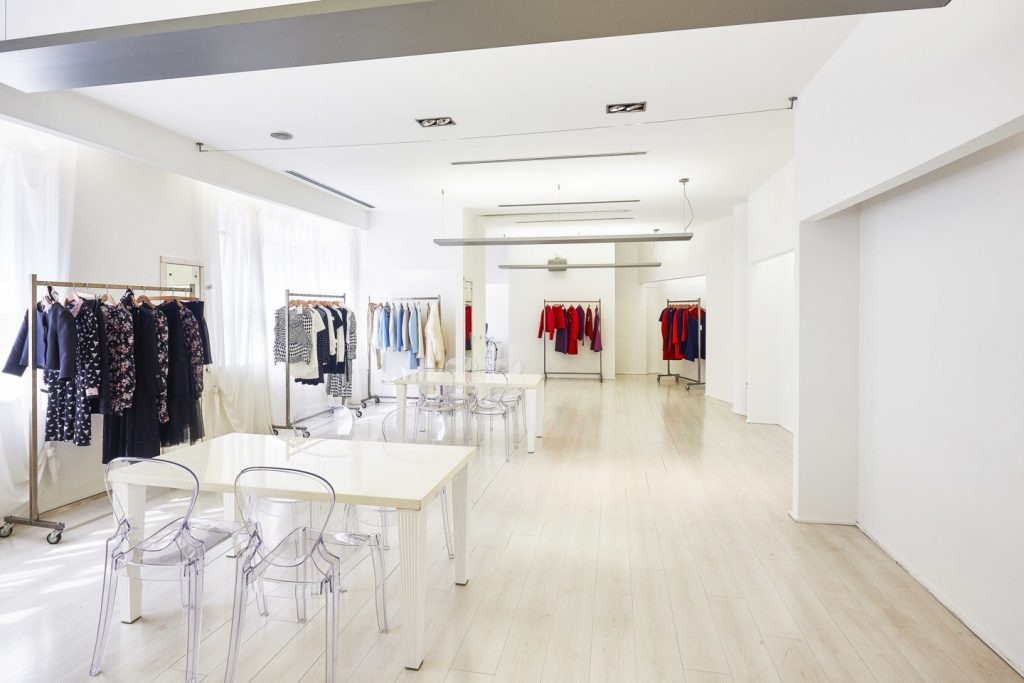
White acts as a backdrop.
It minimizes visual competition and allows colorful merchandise to command attention. This is particularly effective for:
- Bold fashion collections
- Vibrant accessories
- Statement art pieces
However, this benefit only works if lighting and contrast are managed carefully.
The Disadvantages of Using White in Store Design
Despite its versatility, white is not always the right choice.
1. It Can Feel Cold or Empty
White can create a sense of openness — but it can also feel sterile.
In spaces meant to feel intimate, warm, or welcoming, pure white may undermine emotional comfort. Overly bright white interiors can feel clinical rather than experiential.
2. It Exposes Every Imperfection
White reflects everything — including flaws.
Marks, scuffs, uneven paint, and poor lighting become more visible. In short-term activations, where walls may already show wear, this can be problematic.
3. It Requires Strong Supporting Elements
White alone does not create atmosphere.
Without texture, contrast, or accent color, a white space may appear unfinished or generic. White must be supported by:
- Intentional lighting
- Strategic color accents
- Defined merchandising zones
Otherwise, it risks feeling bland.
Choosing the Right Shade of White
Not all whites are the same.
White varies in undertone:
- Cool whites (blue-based)
- Warm whites (pink or apricot undertones)
- Neutral whites
- Linen or off-whites
The right shade depends heavily on lighting conditions.
North-facing spaces with cooler natural light often benefit from warmer whites. Bright, sunlit retail units may work better with cooler whites to maintain crispness.
When selecting a space — particularly in dense retail districts like pop up shops for rent in Paris or pop up shops for rent in New York — assess how natural light interacts with your intended shade.
How to Use White Strategically
If you decide to use white, consider these approaches:
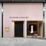
Pair White With Strong Accent Colors
White becomes powerful when contrasted.
Black architectural details, bold product displays, or saturated feature walls can give structure to a white interior. The white-black combination, in particular, creates graphic clarity and sophistication.
Avoid introducing too many additional colors. Limiting the palette to one or two complementary tones maintains cohesion.
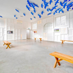
Add Texture to Avoid Flatness
Texture prevents white from feeling sterile.
Consider:
- Matte finishes instead of glossy paint
- Soft fabrics in fitting rooms
- Wood accents for warmth
- Subtle wall molding or paneling
Layered textures add depth without compromising brightness.
Use White to Expand Compact Spaces
White works especially well in small or narrow units.
When paired with vertical merchandising and thoughtful layout planning, it enhances openness. If you are designing within a tight footprint, white can help maintain visual breathing room.
Should You Use White in Your Pop Up Store?
White is neither universally good nor universally bad.
It works best when:
- Your brand identity aligns with minimalism
- You want products to be the visual focus
- The space has adequate lighting
- You incorporate contrast and texture
It may not be suitable if:
- You aim to create warmth and intimacy
- Your lighting is poor
- The retail unit already feels cold
Ultimately, white should be a deliberate choice — not a default.
Final Thoughts
White remains one of the most commonly used colors in retail design because of its versatility and light-enhancing qualities.
But in pop-up environments, where first impressions drive immediate decisions, color must be intentional. White can elevate a space when applied strategically — or flatten it when used without consideration.
If you are developing your full design strategy, revisit our guide to pop up store color psychology to understand how white fits within a broader retail color framework.
- Pop-Up Store Color Psychology: How to Use Color to Attract Customers and Increase Sales - November 4, 2025
- Using White in Retail Design: Should You Choose White for Your Pop Up Store? - May 31, 2025
- Expert Advice: From Logo to Point of Sale – What the Colors You Choose Say About Your Brand’s Identity - July 11, 2018
Related posts:
 How to Use Color to Increase Sales in Your Pop-Up Shop
 Pop Up Store Layout: Floor Plans and Flow Strategies That Convert
 Pop-Up Store Color Psychology: How to Use Color to Attract Customers and Increase Sales
 Expert Advice: Is White the Only Option for a “Neutral” Store?
 12 Ceiling Design Ideas to Elevate Your Pop-Up Store