
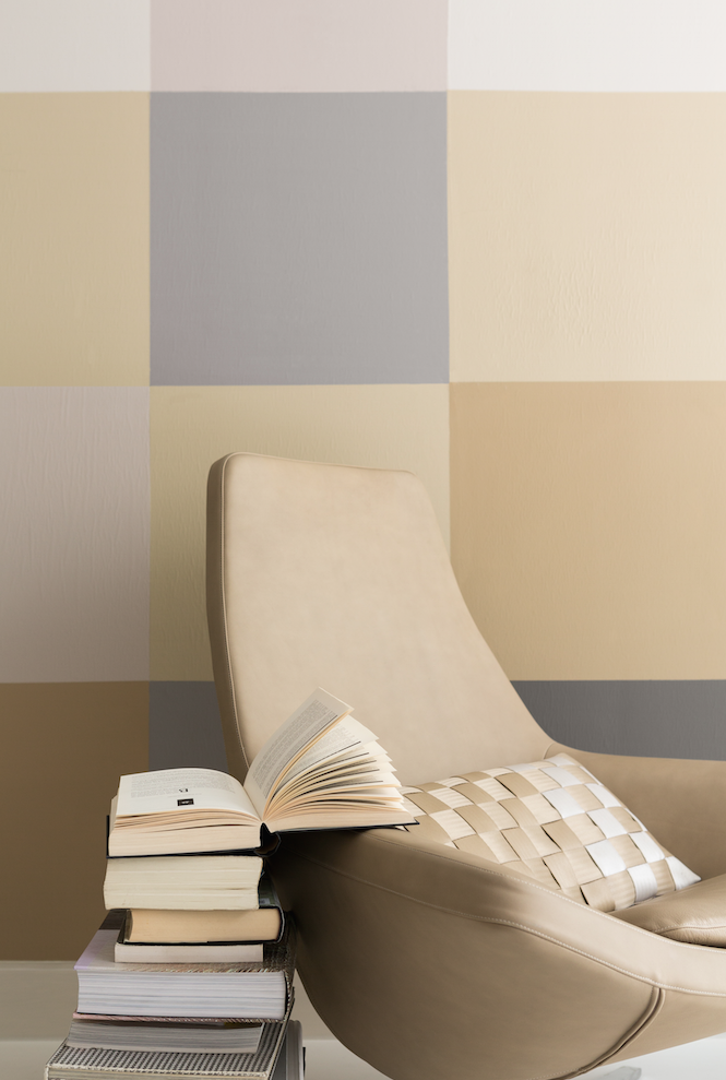
- The lighter the shade chosen, the more luminous it will be, thus creating an effect similar to white.
- These tones are pleasing to the eye and have the enormous advantage of going with all other shades.
- “Neutrals” bring softness to a room, enveloping its walls in a velvety veil of color that is both unobtrusive and quite elegant.
- Similar to white, these very light tones have the added benefit of visually enlarging any space. A very pale gray or soothing beige will always be more enjoyable than pure white, giving customers the feeling of walking into a kind of “cocoon” as soon as they enter the store!
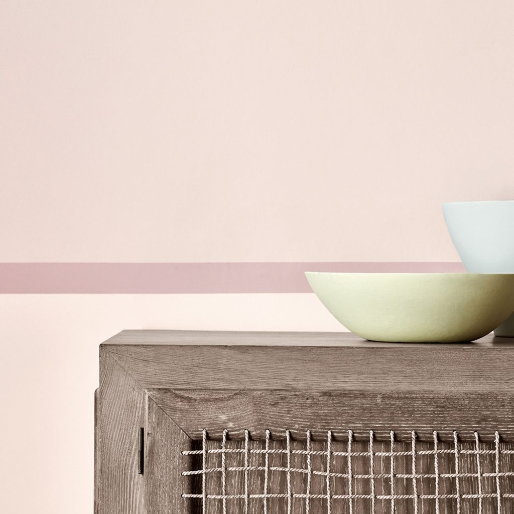
- A very pale pink adds light and softness to walls, which makes the room appear bigger, even in the most confined spaces. (e.g.: Little Greene Dorchester Pink – Mid)
- A “warm” pale pink will warm up a cold room: as the light in north-facing rooms is often a little bluish and will distort the color your products, pink walls counteract the distortion by reflecting a warm glow into the space… (e.g.: Little Greene Confetti)
- On the contrary, rose quartz, a shade of pink inspired by the semi-precious stone, is cooler and can be used to help refresh or soften the walls in south-facing rooms. (e.g.: Rose Quartz Tollens by Pantone. For purchase at Castorama)
For brands
Ready to launch your pop-up?
Find and book your short-term retail space with Storefront.
Find a space
Written by
Contributrice Storefront – Après une carrière de journaliste pour les plus grands magazines déco, je me consacre depuis 2010 à la formation des professionnels de l'univers de la décoration et au conseil des entreprises/particuliers sur les effets psycho-physiques de la couleur dans nos intérieurs.
More from Sophie Mouton-Brisse →