Color is one of the most powerful tools in pop up store design.
Before customers touch a product, speak to staff, or read a price tag, they react to color. It shapes perception, influences mood, directs attention, and can significantly impact purchasing behavior.
In temporary retail environments, where first impressions matter immediately, color choices can determine whether someone walks in or walks past.
If you’re building your activation from the ground up, start with our complete guide to pop up store design. This article focuses specifically on retail color psychology — how color influences customer behavior and how to apply it effectively in pop up shops.
Why Color Psychology Matters in Retail
Retail color psychology studies how different colors influence emotions, perception, and buying decisions.
Color does more than influence aesthetics. In retail environments, environmental color has been shown to affect consumer feelings and purchase likelihood. In a foundational study published in Psychology & Marketing, researchers found that store color conditions influenced shopper mood and buying behavior, demonstrating that color can meaningfully impact purchasing decisions (Bellizzi & Hite, 1992).
Color therefore affects:
- Brand recognition
- Perceived value
- Time spent in store
- Impulse purchasing
- Emotional response
In pop-up shops, color must work harder than in permanent retail. You often have limited time to:
- Capture attention from the street
- Communicate brand identity
- Create an immersive atmosphere
The right color strategy supports these goals instantly.
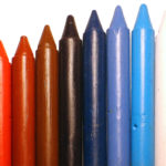
How Customers Emotionally Respond to Color
Different colors trigger different psychological responses.
While context matters, some general associations remain consistent in retail environments. Academic research in marketing has further demonstrated that color influences perception, trust, and decision-making speed across retail contexts. A widely cited review in Management Decision highlights how different hues can shape consumer attitudes and purchasing behavior depending on context and application (Singh, 2006).
Red: Energy and Urgency
Red creates excitement and urgency. It can stimulate appetite and impulse buying, which is why it is often used in clearance sections or promotional displays.
However, overuse can feel overwhelming in small spaces.
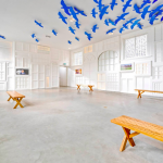
Blue: Trust and Stability
Blue conveys reliability and calm. It works well for menswear, technology brands, and premium positioning.
Cooler tones can also make compact retail spaces feel more open.
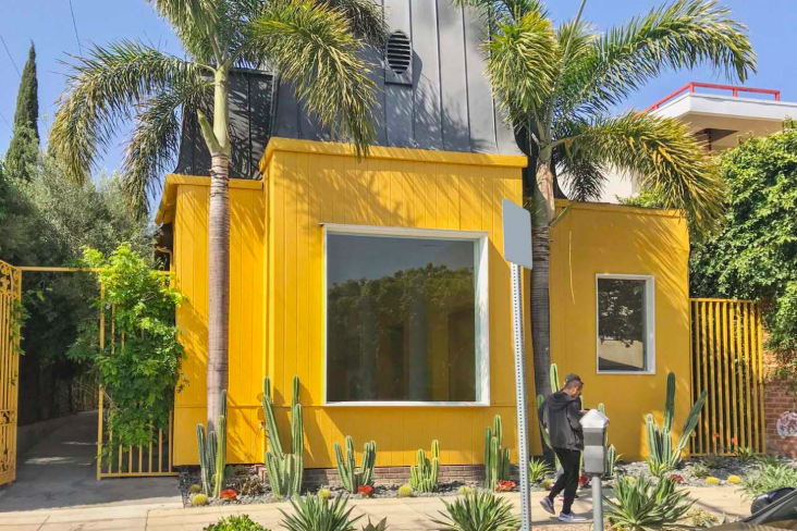
Yellow: Optimism and Attention
Yellow attracts attention quickly. Used strategically, it can highlight new arrivals or limited-edition collections.
Too much yellow, however, may create visual fatigue.
Green: Balance and Sustainability
Green signals health, sustainability, and natural qualities. It works particularly well for wellness brands or environmentally conscious products.
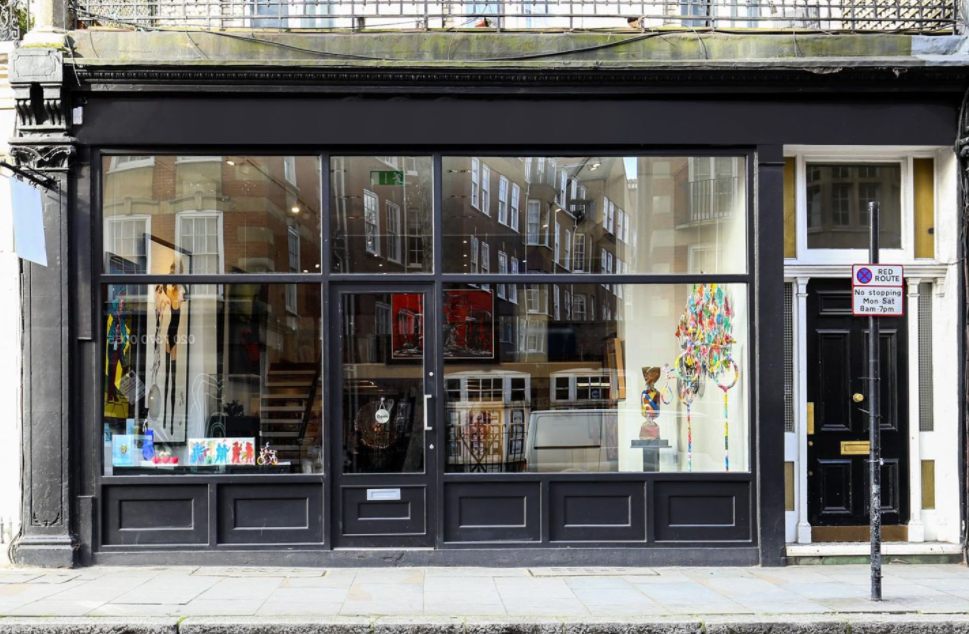
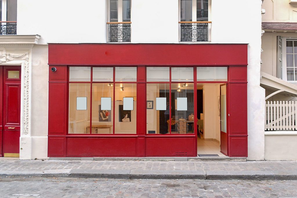
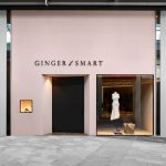
Black: Luxury and Sophistication
Black communicates exclusivity and high-end positioning. In pop-up shops, black can create drama and contrast — especially when paired with focused lighting.
White: Space and Simplicity
White enhances brightness and creates visual breathing room.
For a deeper dive into using white effectively, see our dedicated article on white in retail environments (to be positioned as a supporting splinter).
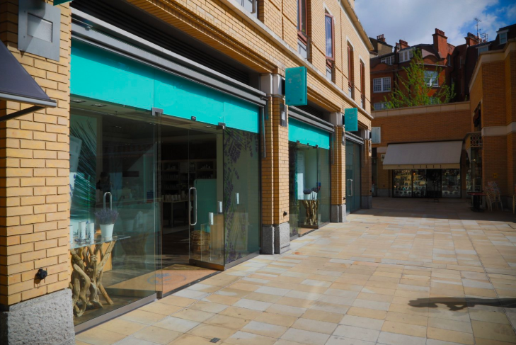
Using Color Strategically in a Pop Up Shop
Understanding color psychology is one thing. Applying it in a temporary retail space is another.
Here’s how to implement it effectively.
1. Align Color With Brand Identity
Your pop-up should feel like a physical extension of your brand.
Ask:
- Are you playful or minimal?
- Premium or accessible?
- Sustainable or tech-forward?
Color should reinforce — not contradict — your positioning.
2. Use Color to Direct Attention
Color can guide customer flow just as layout does.
For example:
- Accent walls can highlight hero products
- Colored plinths can elevate featured items
- Contrasting backdrops can frame bestsellers
When paired with a well-planned pop up store layout, color becomes a directional tool rather than decoration.
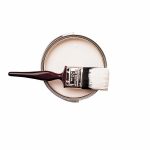
3. Consider Lighting and Color Together
Color never exists independently of light.
Warm lighting intensifies reds and yellows. Cool lighting enhances blues and greens. Poor lighting can distort color entirely.
If you are designing a compact space, review our guide to small pop up shop design to ensure lighting and color work together to increase perceived space.
4. Use Color Blocking for Visual Impact
Color blocking — using large, intentional color zones — creates structure.
For example:
- One bold feature wall
- A monochrome display table
- Contrasting ceiling accents
This works especially well in pop-ups located in high-traffic districts such as those found among pop up shops for rent in London, where competition for visual attention is intense.
5. Balance Bold Colors With Neutral Foundations
In smaller spaces, too many strong colors can feel chaotic.
A common strategy:
- Neutral walls
- Bold accent elements
- Coordinated product displays
This approach maintains clarity while allowing brand colors to stand out.
How Color Influences Purchasing Behavior
Color doesn’t just affect mood — it influences decisions.
Customers often associate certain colors with:
- Quality
- Price level
- Trustworthiness
- Exclusivity
For example:
- Dark, saturated tones often signal premium pricing
- Light neutrals suggest accessibility and approachability
- Earth tones reinforce sustainability
When planning your activation in markets like pop up shops for rent in New York, consider how local retail culture interacts with color trends. Urban environments often support bolder, higher-contrast palettes.
Should You Follow Color Trends?
Trends can generate buzz, but they should never override brand identity.
Temporary retail offers flexibility — you can experiment without long-term commitment.
However, consistency builds recognition. If your online presence uses a specific palette, your pop-up should reflect it.
Color and Social Media Impact
In pop-ups especially, color plays a role beyond the physical space.
Bold, cohesive palettes increase:
- Instagram shareability
- User-generated content
- Brand recall
A photogenic color scheme can turn customers into brand ambassadors.
Common Color Mistakes in Pop Up Shops
Avoid:
- Overusing high-saturation colors in small spaces
- Ignoring lighting conditions
- Mixing too many competing hues
- Choosing colors that clash with product tones
Color should elevate merchandise — not compete with it.
Choosing the Right Space for Your Color Concept
Some spaces naturally support certain color schemes.
High-ceiling, white-box units offer flexibility. Exposed brick or industrial interiors may require more careful coordination.
Explore available spaces in key markets:
The physical environment influences how your color strategy performs.
Final Thoughts on Retail Color Psychology
Color is not a finishing touch — it is a strategic tool.
In pop up shops, where customer decisions happen quickly, the right color choices:
- Attract attention
- Reinforce brand identity
- Guide customer behavior
- Increase confidence
- Support conversion
When combined with thoughtful layout, strong merchandising, and appropriate lighting, color becomes one of the most influential elements in pop up store design.
- Pop-Up Store Color Psychology: How to Use Color to Attract Customers and Increase Sales - November 4, 2025
- Using White in Retail Design: Should You Choose White for Your Pop Up Store? - May 31, 2025
- Expert Advice: From Logo to Point of Sale – What the Colors You Choose Say About Your Brand’s Identity - July 11, 2018
Related posts:
 How to Use Color to Increase Sales in Your Pop-Up Shop
 Pop Up Store Layout: Floor Plans and Flow Strategies That Convert
 Using White in Retail Design: Should You Choose White for Your Pop Up Store?
 Expert Advice: Is White the Only Option for a “Neutral” Store?
 12 Ceiling Design Ideas to Elevate Your Pop-Up Store