A pop-up store has one chance to capture attention. Before a customer steps inside, your window display is doing the selling.
The best pop-up windows are not just decorative. They communicate your concept, signal your brand identity, and create curiosity in seconds. Whether you are launching a product, testing a new market, or building brand awareness, your storefront needs to stop people in their tracks.
Below are three real examples of pop-up store window transformations that show how brands turn empty spaces into high-impact retail experiences.
If you are planning your own activation, you can also explore how to open and run a pop-up store or refine your concept with this guide to pop-up store design strategies.
1. SOGERES
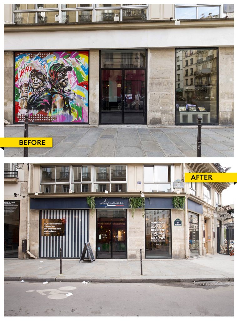
Sogeres, part of the Sodexo Group, launched a two-month pop-up in central Paris to introduce its “Signature” catering concept.
To support the launch, the brand secured a high-visibility retail space in a premium location. You can browse similar opportunities to rent a pop-up store in the 1st Arrondissement.
The challenge
The goal was to communicate a fresh, healthy, and premium food concept to passersby without requiring them to step inside. The window needed to educate and attract at the same time.
What changed
The original space was neutral and lacked identity. The transformation introduced strong graphic elements, vertical lines to emphasize the architecture, and window decals to clearly communicate the brand’s offering.
The result
The addition of greenery elevated the entire storefront, reinforcing the brand’s “fresh and healthy” positioning. The window became both a marketing tool and a visual extension of the product.
Key takeaway
Use your window as a communication channel, not just decoration. Clear messaging combined with subtle design elements can instantly convey your concept.
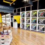
2. MASTER & DYNAMIC
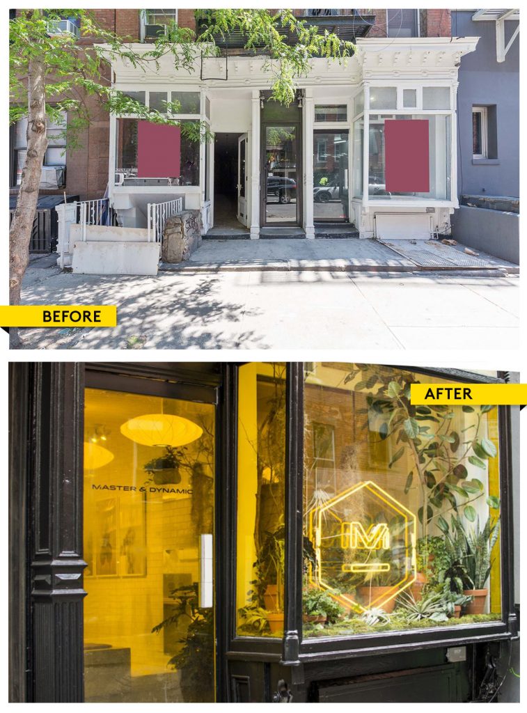
Master & Dynamic transformed a Nolita storefront into a bold, immersive retail experience inspired by New York City.
If you are targeting a similar audience, explore available pop-up shops in Nolita.
For a deeper breakdown of this activation, read the full Master & Dynamic pop-up case study.
The challenge
The brand wanted to pay tribute to New York while standing out in one of the city’s most competitive retail neighborhoods.
What changed
The storefront was transformed into a greenhouse-inspired concept with bold neon yellow accents and layered plant installations.
The result
The window became a preview of the in-store experience. Passersby could immediately understand the atmosphere and aesthetic, which increased foot traffic and engagement.
Key takeaway
Focus on one strong concept and execute it fully. A clear visual identity is more effective than trying to communicate too many ideas at once.
3. WINSER LONDON
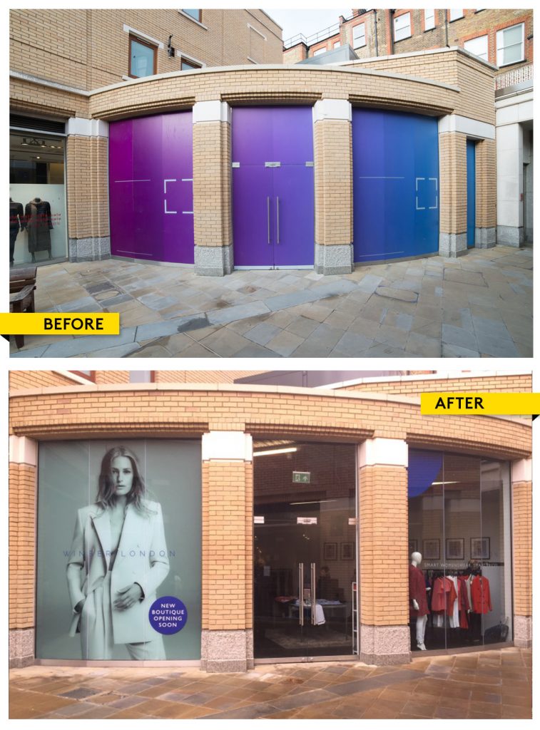
Winser London opened a pop-up in Duke of York Square, choosing the location based on strong existing customer demand.
You can read more about their strategy in the Winser London pop-up case study.
The challenge
The brand needed to capture high foot traffic while maintaining a premium, understated aesthetic that aligned with its positioning.
What changed
Rather than over-designing the space, the brand worked with the existing architecture. Large windows were left open and clean, allowing visibility into the curated interior and product displays.
The result
The simplicity created a high-end feel. The window acted as a frame, showcasing the collection and inviting customers inside without overwhelming them.
Key takeaway
Not every pop-up needs heavy decoration. Sometimes the most effective window display is one that highlights the space and product with minimal intervention.
What Makes a Pop-Up Window Display Effective
Across all three examples, a few consistent principles emerge:
- Your window should clearly communicate your concept in seconds
- Strong visual identity outperforms cluttered messaging
- The display should reflect what customers will experience inside
- Simplicity often creates a more premium perception
A well-executed window display is one of the most powerful tools in short-term retail. It bridges the gap between foot traffic and conversions.
If you are planning your next activation, start by defining your concept, then choose a space that supports it. From there, your window becomes the first step in the customer journey.
- Before and After: 3 Pop-Up Store Window Displays That Attract Customers - March 26, 2026
- Is There an Airbnb for Commercial Space? - March 2, 2026
- How Your Business Can Benefit from the Right Office Space in Dubai – - November 14, 2023
Related posts:
 How to Use Color to Increase Sales in Your Pop-Up Shop
 Expert Advice: Is White the Only Option for a “Neutral” Store?
 Before and After: 3 Pop-Up Store Transformations That Bring Spaces to Life
 Photo Flip: 13 Charming Shops For Rent in Le Marais for Lovers of Parisian Architecture